10 great careers page examples – and why we love them
Career pages are sections of a company's website dedicated to showcasing its employer brand and presenting job openings. They are crucial as they offer an opportunity to attract and engage potential candidates, provide information about the company culture, and present open roles in an organized manner.

Pretend for a moment that you’re a job seeker. While browsing job ads, you find one that fits you. But what’s the work environment like at that company? Who will you be working with? And if you want to occasionally work from home, will you be able to?
If only you had the answers to these questions before applying. Wait… maybe you can find them yourself? So where do you look? The careers page, of course. The portal that connects employers with potential employees; that’s the place to look for those answers.
But it’s not as simple as sharing information about the company itself. Company career pages should be more than just a shop window for open roles. They give employers the chance to promote their workplace, share images and videos of their offices and staff and describe any employee benefits they offer.
If you’re in the process of designing your own careers page or if you want to revamp your existing one, we can give you a head start by presenting you with our favorite career sites.
Contents
Top 10 careers page examples for different scenarios
When you want to showcase your culture
It’s a challenge to promote your company culture without overselling yourself. Surely, in a careers page, you can’t talk about those less attractive things that could and do happen at work, such as occasional overtime, offices in an unsexy location, or salaries a touch below the industry average.
If you try to sugarcoat everything about your work life, you risk sounding inauthentic. Candidates don’t expect to find negative things about your company in your own site, but big, bold statements of “how happy your employees are” or “how you’ve built the best workplace” are too vague and abstract. It’s best to give candidates something more tangible.
Here are two examples of how you can describe your company culture in a genuine and informative way:
Curology
As a personalized skincare brand rooted in science and care, Curology needed a careers page that reflects its modern, approachable, and mission-driven identity. Their page balances professionalism with warmth, showing that they’re just as invested in their people as they are in their customers’ skin.
The clean layout, friendly tone, and inclusive visuals make it easy for candidates to explore open roles while getting a feel for the culture. With clear values and team-centric messaging, it’s obvious that Curology is building more than products — they’re building a thoughtful, people-first workplace.
Onfido
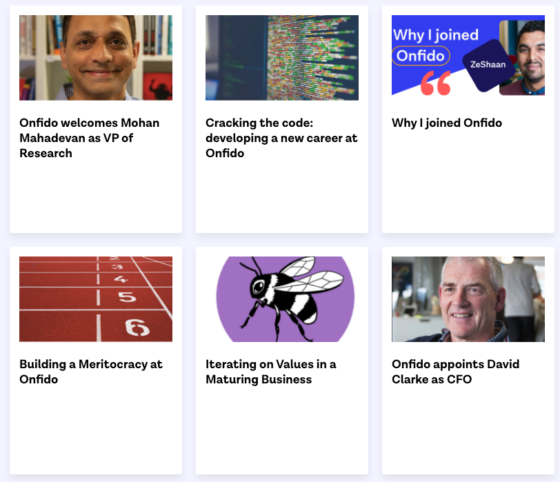
Most career sites contain some basic information about the company, the current job openings and perhaps a few pictures of the workspace. Onfido, though, digs into recruitment marketing and presents something not that common in careers pages: blog posts written by their employees.
Some of these articles introduce new team members, while in others, employees describe their career path that lead them to Onfido. What’s the most interesting about this section is blog posts that talk about company values or other decisions that impact work life. For example, see this article that talks about Onfido’s stance on Brexit or this one that explains how the company prioritizes mental health.
When you have jobs in multiple locations
If you have offices in different cities or even in different places across the world, you face a challenge. You want candidates to be able to search for job opportunities specifically at their desired location, but you also want to maintain – and communicate – a uniform employer brand.
How can you tackle this challenge? With an easy-to-navigate careers page. Let’s look at an example from the hospitality industry:
Belmond
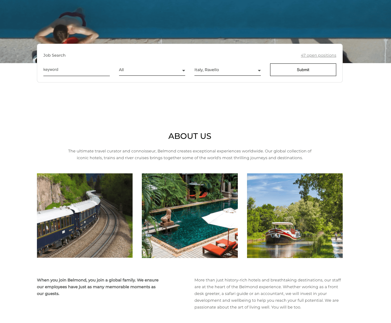
The popular hotel company has built a careers page that prioritizes the user experience. At the top of the page, a search bar lets job seekers filter open positions based on keyword, location and/or department. This way, they can quickly view only the jobs that matter to them the most in the locations they’re most interested in.
Of course, some candidates want to learn more about the company before deciding whether to apply or not. Belmond’s careers page makes that easy too, describing what’s it like working there:
Candidates can then pick their field of interest to find out more and browse job opportunities that fall under this category.
When you’re not a popular brand (yet)
Surely, for the Googles and Microsofts of the world, it’s easy to find numerous candidates who would apply in the blink of an eye. But what about those companies who aren’t quite at that level of brand recognition?
If you’re new in the market or if you’re a small company, it’s only natural that job seekers may not have heard about you. So, if they see one of your job ads and are interested in it, they’ll probably want to learn more about you before applying. So, you need to capture candidates’ attention and make a stellar first impression with a strong careers page:
Mito
This Hungarian communication agency delivers its powerful message “We love clever things” in its careers page with a tweak:
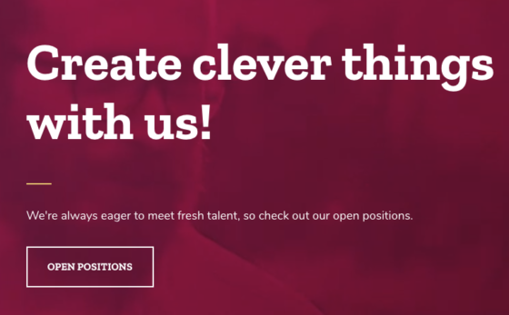
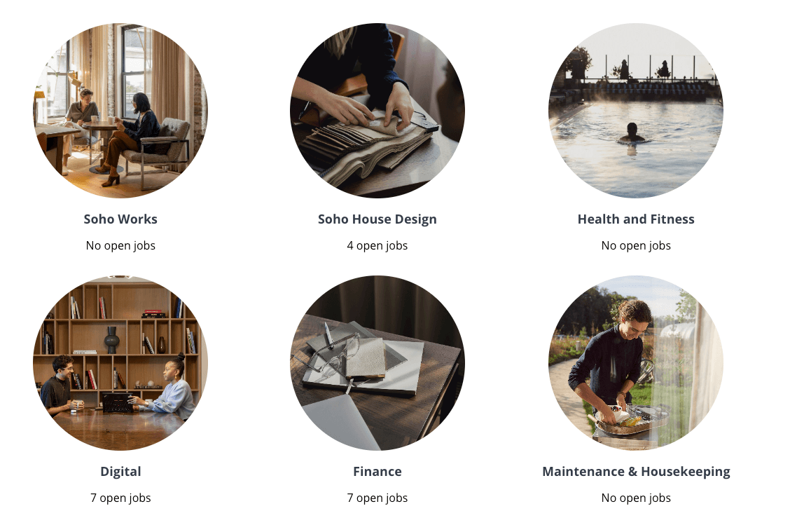
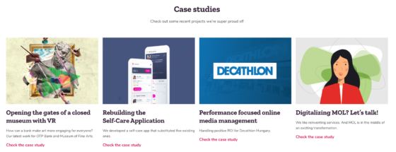
But they don’t want to be vague about those “clever things”. For each business unit, there’s a dedicated section with case studies, clients and team projects. This way, potential candidates get an idea of the type of projects they’ll work on if hired. Plus, they’ll believe that Mito is more than just all talk and no action. Here are some of the case studies from the Digital unit:
Purple
This WiFi platform’s focus is clear: they want candidates to be able to browse job opportunities by location. But they don’t leave it at that. They stand out among other tech companies by adding a personal touch to their careers blog. Job seekers can read interesting articles, including an interview with the company’s CEO and the sales team’s takeaways from a Salesforce event. There’s also a fun story that cleverly explains why the company’s location is better than it sounds.

When you want to keep it simple
Simple doesn’t mean boring. Or, poor in content. A simple careers page is about minimal design and clear copy. There are many reasons why you might want to go towards this direction when building your careers page. For example, you may not have the budget for a very fancy website, or you want to ensure that job seekers won’t get overwhelmed with information. Or, perhaps, a simple design better matches your company’s overall aesthetics.
Here’s an example of a beautifully designed, yet simple, careers page:
Netguru
This Polish software development company uses its characteristic green neon color to illustrate its careers page and highlight the different categories:
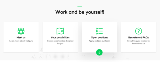
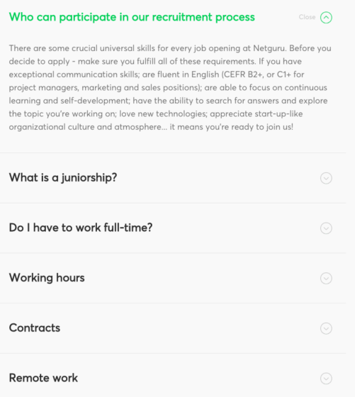
Job seekers can browse those different sections to find exactly the type of information they’re seeking. For example, if they want to learn more about the team at Netguru, by clicking the “Meet us” sub-category, they’ll find articles that describe work life and past projects and they’ll read what kind of perks employees have. Likewise, if they’re already considering to apply, a visit to the Recruitment FAQs section will answer the more specific questions on candidates’ minds.
When you want to describe your work life
A careers page is your way to “speak” to would-be candidates before they’re even candidates. You can hook them by describing attractive benefits, a healthy work-life balance and career development opportunities. But there’s a catch. You don’t want to create a profile of “The Ideal Employer”. You want to be realistic in your recruitment marketing in order to attract like-minded employees, such as in the following examples:
Huckletree
You don’t need much to liven up your careers page – that’s a lesson we get from Huckletree, a company that offers coworking spaces in Dublin, Manchester and London. In less than a minute, the following video shows how the workspaces look like and what the company values are:
MarketFinance
The first thing you’ll see when visiting this careers page is a statement of this UK-based finance platform’s company culture followed by three core values. This shows how much emphasis MarketFinance puts on hiring like-minded people. But, describing your culture in a few words or through eye-catching slogans is usually not enough. That’s why they’re letting their employees do the talking.
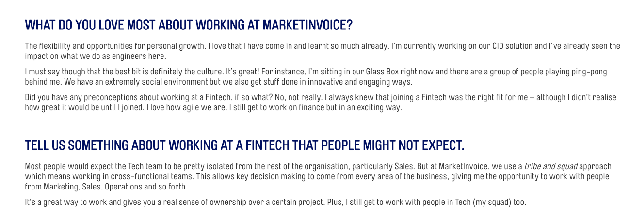
In the “Meet the team” section, candidates can read mini-interviews where employees from different departments describe their roles, the challenges they face and their career goals. This way, people considering a job at MarketFinance get a more authentic overview of the position directly from those who work there and learn what skills are necessary in order to succeed.
When you emphasize candidate experience
Ask anyone who’s ever been in the lookout for a job about their biggest frustration and the most common answer you’ll get is “not hearing back from a company where I applied”. Resumes that fall into a black hole, hiring processes that seem to last forever and unexpected tests and assignments. These all turn candidates off.
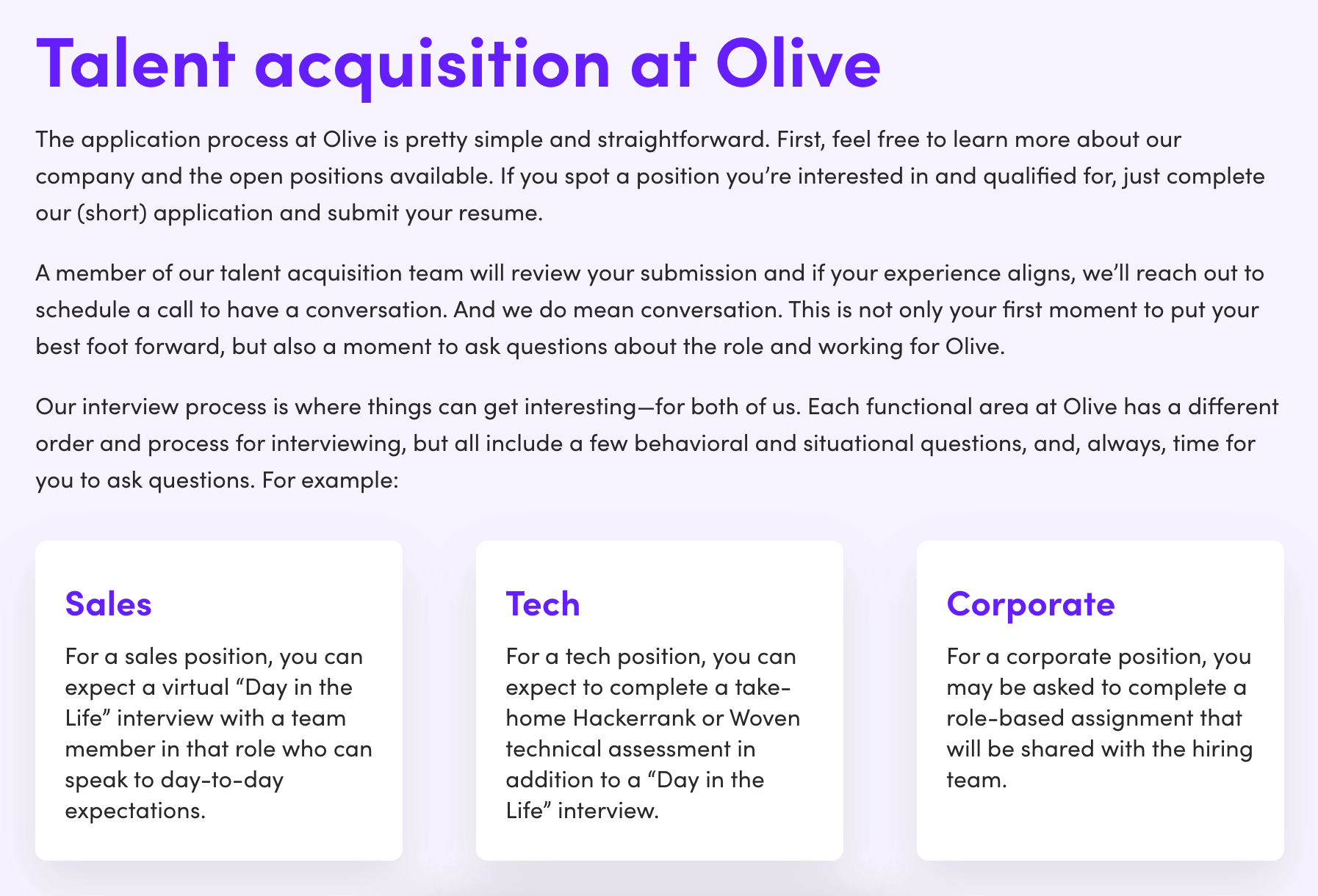
To build a positive candidate experience, and therefore boost your reputation among job seekers, it’s best to be as transparent as possible about your recruitment process. Here’s an example of how you can do that:
This AI-powered software, which aims to bridge efficiency gaps in the healthcare industry, is direct and descriptive in their careers page about what candidates can expect before even applying. Olive emphasizes that a TA professional will reach out to ideal applicants to have a conversation. “And we do mean conversation”, they stress in the careers page. There are also details on what the evaluation will look like based on the function and department (i.e. sales, tech, corporate), and a confident statement that written and verbal communication will be maintained every step of the way – even if a candidate doesn’t make it to the next step.
When you want… to be unique
Now, here’s an exercise for you: what is it that you want to tell job seekers through your careers page? What makes your company a desirable place to work? What makes your company special and unlike any other out there?
You don’t have to answer these questions immediately. Check with your colleagues first. Ask them questions such as:
- What do you wish you had known about the company beforehand?
- What do you like the most about your job?
- What makes you happiest at work?
- What keeps you productive?
- How have you developed your skills through your time here?
- How would you describe your work life to a friend?
Make sure to talk with employees from all departments to get different perspectives. Then, it’s time to set up your site. You can use the aforementioned career page examples as an inspiration but don’t forget to add your unique touch. That’s the only way to attract candidates who want to work specifically with you.
Here are some additional resources to help you build an effective career site:
FAQ guide: Everything you want to ask about career pages
How to improve your careers page design
How to attract candidates by improving your careers page
What do the best careers pages have in common?
Common mistakes in career pages
Looking for ways to advertise your job ads outside your careers page? Have a look at these great job ad examples.
Frequently asked questions
- What is a career page?
- A career page serves to showcase a company's employer brand, culture, and job openings. It's a platform to attract, engage, and inform potential candidates about the company and its opportunities.
- What should a career page include?
- A career page should include information about the company, its culture, values, and benefits. It should also list current job openings, provide a way for candidates to apply, and offer an option to sign up for job alerts.
- How can a career page enhance the recruitment process?
- A well-designed career page can streamline the recruitment process by attracting suitable candidates, providing necessary information, and facilitating easy application. It can also help build a talent pipeline through job alerts.
- How can a career page reflect a company's culture?
- A career page can reflect a company's culture through its design, content, images, and videos. Employee testimonials, descriptions of company values, and insights into daily work life can also help convey the culture.
- Are LinkedIn Career pages beneficial?
- Yes, LinkedIn Career Pages offer additional ways to showcase a company and tell its story. They can provide a more detailed picture of the company, its work, and its culture, enhancing the company's visibility and attractiveness to potential candidates.

