How to attract candidates by improving your careers page

Your careers page is your personal pitch to candidates. It’s a place to show job seekers why your company is attractive, and make it easy for them to apply to open roles.
Here are careers page examples that will motivate potential hires to apply to your jobs:
Display your jobs prominently
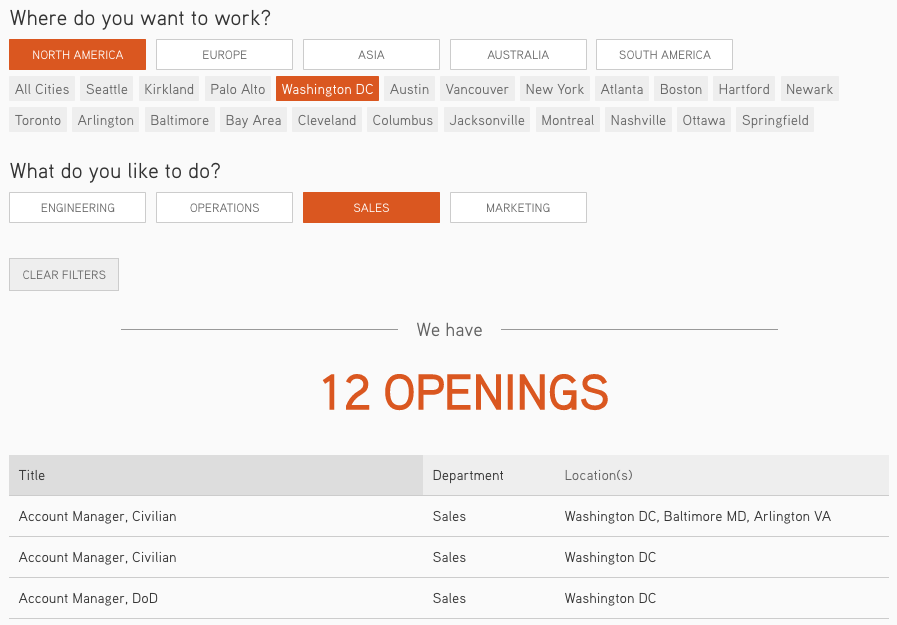
Job listings are the main players of your careers page. Help candidates discover them with a minimum number of clicks. If possible, display jobs and job filters (e.g. by location or department) on the front page of your career page design. Tableau, a business intelligence software company, does this well by grouping their jobs in a clear and accessible way:

Aim for a hassle-free application
Most candidates quit a lengthy or complicated application process. When candidates click “Apply,” they don’t want to answer scores of questions asking for information that can be found on their resumes. Fill out your application form to test drive your current design, and ask:
- Are all fields necessary?
- Are we asking for information that we don’t need at this stage?
- Are we asking for information we can find on resumes and social profiles?
- Does the question format make sense (e.g. multiple choice vs. open-ended questions)?
- Are we asking for information that isn’t pertinent (e.g. college grades)?
Aim for a quick, streamlined application design over a complicated one. Ask candidates to upload their resumes and cover letters, and answer only a couple of qualifying questions. An Applicant Tracking System (ATS) can help you create (or improve) a single page application form.
Showcase your culture
Candidates want to learn about a company’s culture before they consider applying for open roles. Your careers page is a good place to spotlight your culture and mission and offer insights into what kind of employees you’re looking for. Graphics, videos and slogans can help you communicate your message.
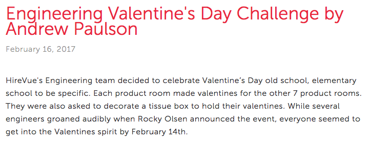
The popular digital video company, HireVue, has a branded careers site Vue Nation. It includes an engaging mission statement, an interactive animation showcasing HireVue’s values (“AttriVutes”) and a blog with posts and photos that capture HireVue’s culture:

Talk about your benefits
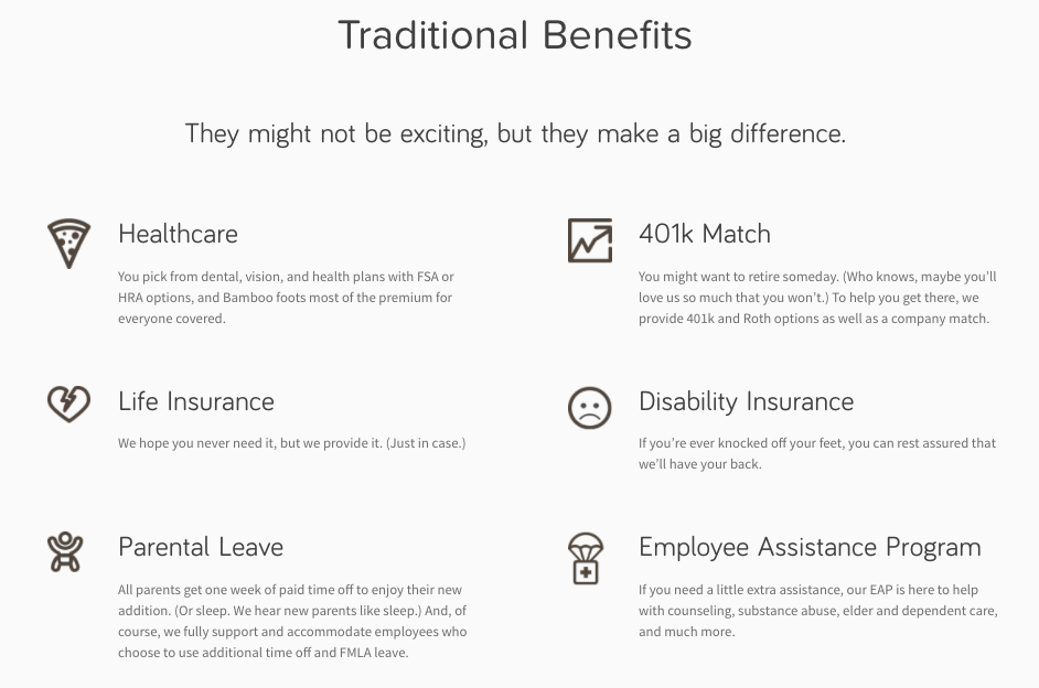
Candidates value information about benefits. In fact, they consider it the most important job attribute employers offer. HR software company BambooHR offers a summary of their benefits in their career page content:

Offer job seekers inside information
Job seekers want to find out whether your company is worth applying to. It’s why they visit sites like Glassdoor or your LinkedIn company page: to get behind-the-scenes information about your business. Personalize your careers page by featuring team members’ opinions.Any information that may motivate candidates to apply is worth sharing. Payment technology company Stripe’s careers page includes a link to Stripe Stories on Medium, where employees talk about their life at Stripe:

Keep your careers page current
Ninety-four percent of job seekers are more likely to apply to a job if an employer is actively managing their company brand. That includes responding to reviews and sharing details about your culture. Occasionally updating pictures, videos and copy on your careers page keeps it fresh and helps candidates visualize how your company grows. When improving your careers page, consider posting news about new offices, testimonials from recent hires or pictures from your latest team activity.
Build a mobile version of your careers page
A Glassdoor survey found that nearly 60 percent of job seekers want to be able to save a job from their mobile device (either by bookmarking or creating a careers site account) and apply later on a desktop. A mobile-friendly careers site is a must to attract candidates, and can prevent them from bouncing.
Here are a few tips to improve the mobile version of your careers page:
- Keep your copy short and punchy. It’d be burdensome for candidates to scroll down long paragraphs of copy on a mobile device.
- Avoid graphics or videos that take a long time to load. Candidates might get frustrated if your mobile page isn’t quickly accessible.
- Ensure your page adapts to various screen sizes. Candidates may want to browse your careers page from different types of phones or tablets.
- Simplify your application process (again.) Going through multiple pages to apply is more difficult on mobile devices than on desktops. Also, according to LinkedIn, resume and cover letter uploads aren’t cut out for mobile. Avoid pop up windows in your mobile application processes, too.
Measure and test your careers page’s effectiveness
One of the main measurements of the success of your careers page is its conversion rate. A careers page conversion rate measures what percentage of visitors actually applied to a job on your page. So, if 1,000 job seekers visit your careers page and 150 of them applied, your conversion rate is 150/1,000 = 15%. Comparing the conversion rates of your careers page over time can be instructional (for example, you can measure the impact of a careers page redesign by monitoring changes in your conversion rate.)
Google Analytics helps you track your conversion rates. And Google’s User Explorer feature gives you more detailed information about how people interact with your careers site.
Your careers page is a powerful employer branding tool. Continue to explore new opportunities for improving it. Measure your efforts. And keep it fresh.


