Company career page content: do’s and don’ts

A great careers page is the best way to get potential job candidates to consider your company. However, on average, 90 percent of careers page visitors leave immediately. What mistakes make a potential job candidate bounce? Avoid these five common ones to build a strong company career page focused on getting the most qualified people to apply to your jobs.
1. Listing endless job requirements
Think of your job description and requirements as an advertisement.Your career page content should convey the general idea of your open positions and highlight the most enticing aspects. Don’t list out every job requirement on your careers page, especially those that are particularly cumbersome or would be better discussed in person. The more specific you are about requirements, the more likely candidates are to self-select out of your hiring process. If a person sees a position that they are mostly qualified for, but are missing one or two flexible elements, you may miss out on an excellent candidate.
Job descriptions that are too long or too short can deter job applicants from even the best company career pages. A report from Appcast.io found that job descriptions between 4,000 and 5,000 characters get the most job applications.
2. Using too many buzzwords
Your job candidates know their qualifications and the job titles they’re looking for. What they might not know is what you’re looking for when you advertise “rockstar” or “ninja” roles. Answering a question about these kinds of buzzwords on Quora, tech investor and former Facebook product designer Bobby Goodlatte says that they “come across more neo-corporate than anything else. The company posting the job is trying to communicate they “get it” by using words like ninja and rockstar. That inauthenticity scares away the more rogue/unorthodox hacker types that the terms ninja or rockstar try to target.” The best company career pages use a combination of trendy and easy to sea
The team at InsightSquared compiled a list of buzzwords that sales professionals are tired of hearing, including “leading,” “innovative,” “intuitive” and “strategic.” If you are using these words, it might be worth finding more unique, concise ways to describe the work your company is doing and the qualities you’re looking for in candidates.
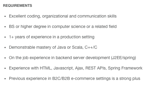
The team at Tile uses clear and concise language in their job descriptions on their company careers page. Without over-explaining, they list the most crucial elements for the position they’re hiring for (here, a Backend Engineer).

Tools like Textio can help you address off-putting language in your job descriptions. Phrases like “proven” or “under pressure” tend to attract more male candidates, while “exceptional” and “validated” tend to attract more female candidates. By simply tweaking your language, you can appeal to a more diverse group of candidates.
Related: Everything HR managers and recruiters need to know to build an effective careers page
3. Using a confusing schema with too many links
If you’re using a bulky applicant tracking system to design your company careers page, candidates often have to scroll through dozens of positions, filtering by keyword or location, before finding relevant positions. Having one clear system makes searching less confusing for candidates.
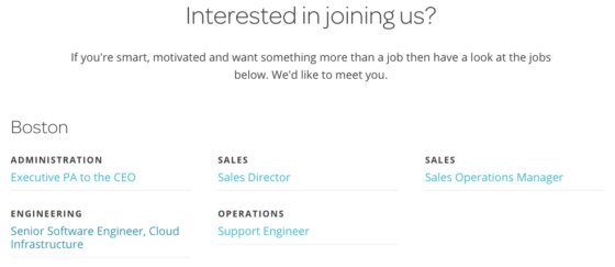
The Workable career page content is organized by location, then by team. This allows candidates to get a full idea of our hiring landscape and quickly click through to jobs that interest them.

4. Having no clear flow
Do candidates email you their resume? Connect through LinkedIn? Tweet you for more information? Having a disjointed process detracts applicants and reflects poorly on your employer brand. The hiring process at your company should follow one clear flow. And it should be clear to your applicants and hiring managers. As you build your talent pool and learn which job posting sites are most effective for you, your hiring process will evolve and become clearer.
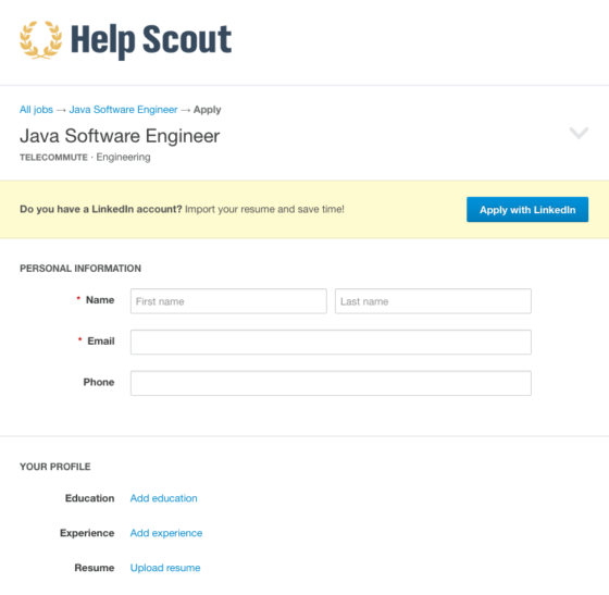
With an ATS, you can funnel all your applicants through one system and collect extra information from candidates’ social profiles. Helpscout, like many of our other customers, has a simple application in this careers page example that allows candidates to import their resume from LinkedIn.

5. Making culture the main focus
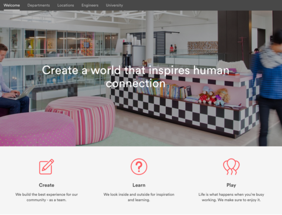
Applicants are coming to your careers page to see if your job is a good fit for them. It’s great to show them photos and videos of what it’s like to work for your company, but this shouldn’t come at the expense of site functionality. Burying an “Apply Now” link below the fold (after a lot of scrolling) is a surefire way to confuse your applicants. For a beautifully designed careers page, Airbnb buries their actual job listings and application under a cumbersome amount of information and in an inconspicuous top navigation. Make sure that you’re selling the right product: your culture is the icing, your careers are the cake.


