What do the best career pages have in common?

You’ve put a lot of work into your website in order to sell your product. It boasts beautiful design, photos and testimonials. But what does it do to attract potential employees? It’s important to remember that online you’re talking to two audiences: customers and talent. The best career pages attract a range of relevant candidates and frame their early idea of what it would be like to work with you. We’ve collected some of the best career page examples to illustrate how to up your candidate conversion rate from your career page.
When it’s done right, great company career pages should provide enough information and flavor for these prospects to self-select if they are a good fit, give them a sense where they’re qualified for the job, and deliver them an easy application process.
Tell your story
Career pages should tell your company story and inspire others to be part of your mission and goals. Using your career page as an example of your work, both completed and aspirational, can create buy-in from potential employees right when they land on your page.
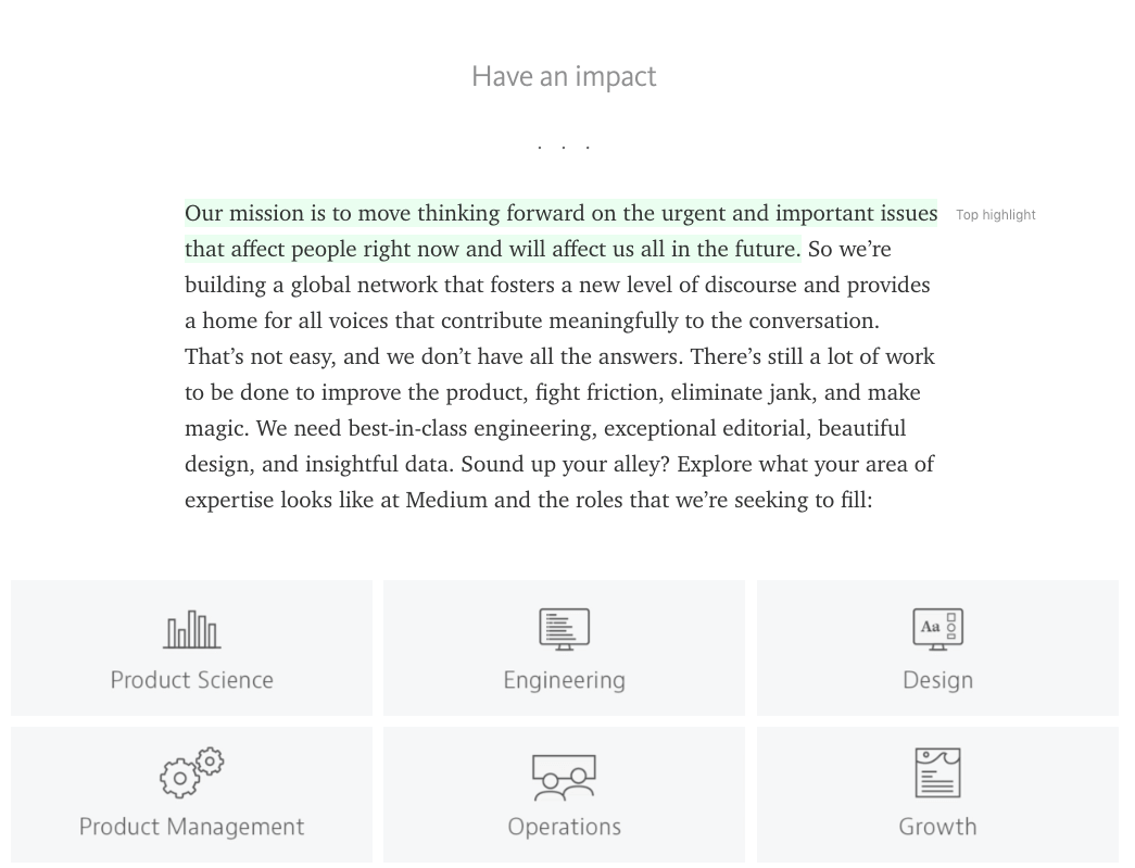
Medium has nailed this by using their publishing platform as their careers page, showcasing that their focus is on storytelling, which is well-represented as they talk about their company, position and goals.

What are the most crucial aspects of your company? Are they your product, your team, your purpose? By keeping this at the forefront of your career pages’ design, you can be sure that your potential candidates will begin to understand what it means like to work at your company.
Fit
What is it really like to work at your company? Beyond buzzwords and benefits, the best company career pages use photos, videos and testimonials to show what a day-in-the-life really looks like . In hiring, cultural fit plays an even bigger role than skill or background. This is true for both hiring managers and candidates.
The biggest endorsement for potential candidates is word of mouth recommendations. What do your current employees like about the company and what kind of traits do they think thrive there? Showcase these with testimonials in video or text.
Helpscout has an excellent video that showcases one of their most crucial cultural aspects, remote work. However, they deliver this message through their enthusiastic employees, making its message even more effective and likely to resonate with potential candidates.
Related: Everything HR managers and recruiters need to know to build an effective careers page
By sharing information in the same manners as sharing a testimonial, your new candidates will already feel like they understand both the practical and emotional aspects of working at your company.

Have you created additional information about being an employee? Link to relevant blog posts, videos or other additional content on your career pages that could help a potential candidate determine if they would fit in at your company.
Meet the team
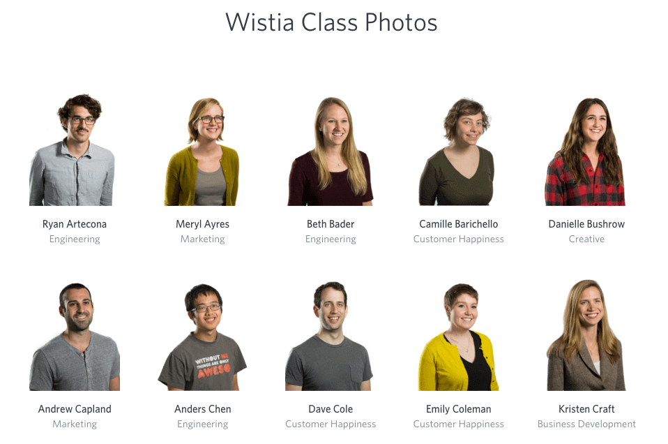
There’s more to attracting a potential customer than just your job listings. Your potential candidates are clicking all over your website to learn about what your company is like. What people are doing and where people are doing it can pale in comparison to whom they are doing it with. Make sure that your Meet The Team page showcases current photos of your employees with their active roles, ways to learn more about them, and a window on their personality. Medium embeds tweets from existing team members to give you a sense of what they’re like. The team at Wistia has their Class Yearbook with individual photos, job titles, Twitter handles and fun photos, creating a real fear-of-missing-out by not being on their team.

Relevant information
Though your candidates will love to see the photos and videos of your team, it’s most important for them to understand what your company does, the job that you’re hiring for, and if they’re qualified to apply. All of this information is easily accessible on the best career pages.
Job-seekers are discerning with limited time. They aren’t interested in scrolling through a million platitudes to get to qualifications for a position. Be upfront, clear and concise with what you’re looking for. Use common keywords and accepted language. Though creativity is an asset in many elements of your careers page, don’t substitute it for solid information.
As you compete against other companies for your desired talent, your benefits package will always be a big asset. Be clear about the perks and benefits of joining your company, especially what sets you apart.
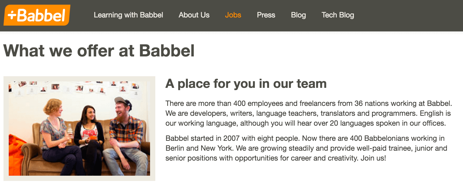
Babbel’s page explicitly outlines what they offer competitively: culture, organization and office life. They get to the point with their job titles and job descriptions, outlining their benefits, responsibilities and requirements without being extravagant.

Candidate-focused UX
When a candidate arrives on your careers page, they could be in any stage of the applicant funnel. Are they just looking for general information about your company and potential job openings? Are they ready to submit an application? Are they following up on something they’ve already submitted? Or, are they at any one of a number of stages in between these processes.
In any case, the experience on the best career pages is clear and caters to the desired audience: job applicants. Here at Workable, a huge compliment has been that people have applied to work for us because they enjoyed the well-designed application process and user experience of our clients.
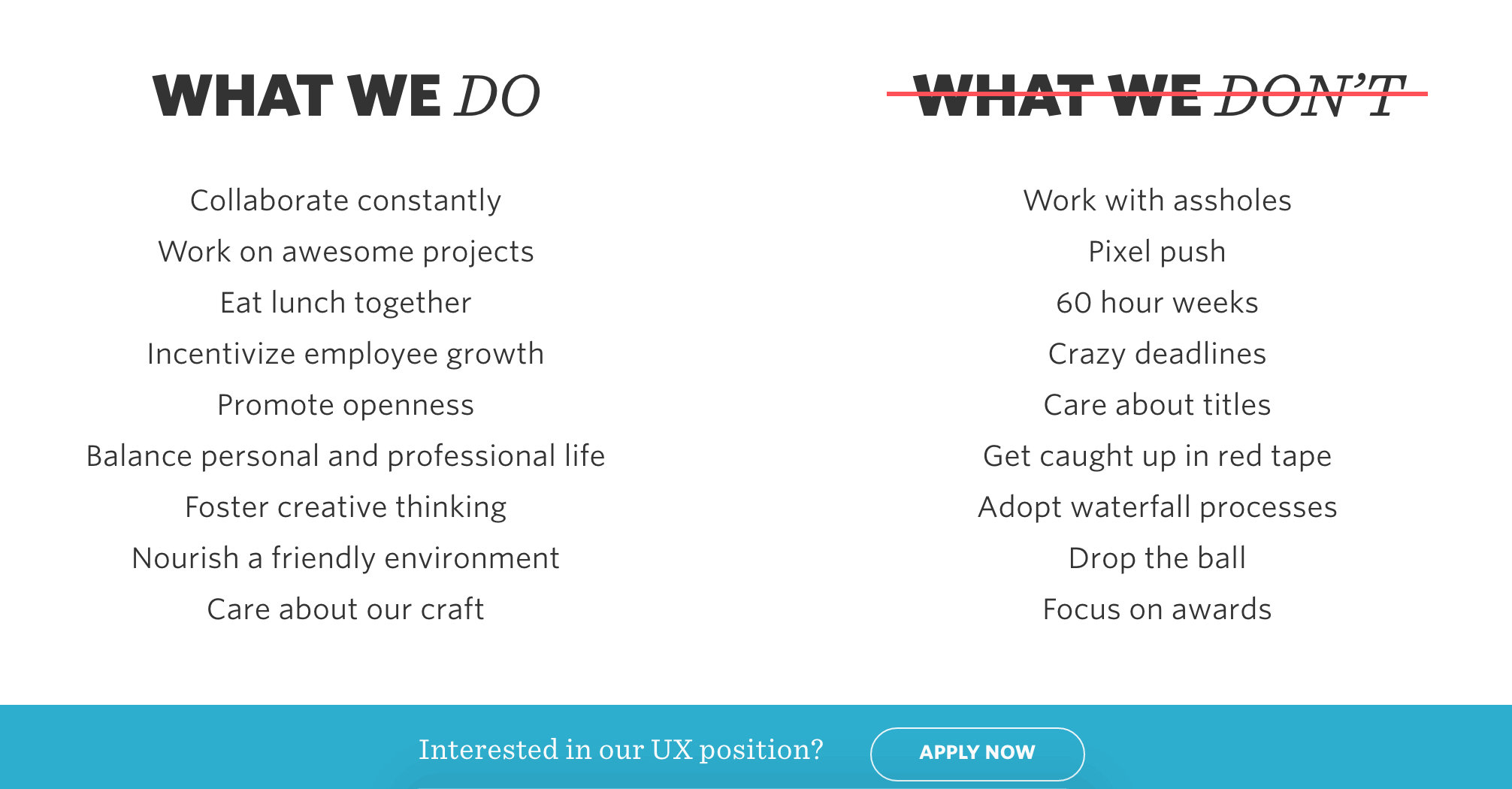
Make the path to application easy to navigate and clear. The team at Digital Telepathy nails this: their job listings pages are thorough, and answer upfront as many questions as possible. Their current listing for a Senior UX & UI Designer has explicit listed projects, “What We Do” and “What We Don’t,” explicit benefits, a short skills test and application all on a single page.


