How to improve your careers page design

Your careers page is the best place to attract new candidates. As prospective employees look through your website, they should get an idea of what it’s like to work at your company – and that can happen with a good career page design/UX (user experience).
If you wonder how to improve your career page design, keep the following UX tactics in mind to convey your employer brand and attract the best candidates.
Contents
Be clear

Listing your job titles by team, as Mention does, helps candidates quickly find the information they need, i.e. the open positions that interest them the most. You can also filter jobs by location and give some details about each department. A great careers page design will emphasize clarity, using dark-colored text on light-colored backgrounds, simple and direct language, and clear URLs. Candidates want to identify the job they are most qualified for, so make it easy for them.
Be accessible

Careers pages are nearly always found in a company website’s primary navigation under or next to “About,” “Company,” or “Corporate” header. You will usually find a link to the careers page at the footer of the company’s website, too. By following this industry norm for career pages UX, you can attract job seekers who are actively looking at career pages in websites. If your careers section is hidden deep in your “contact” page or requires more than one click to find, you risk losing candidates.
One of the best career page design examples is Digital Telepathy. Their careers page has equal importance as services and work. This way, candidates can easily find job opportunities and see that the company values their employees.
Related: Everything HR managers and recruiters need to know to build an effective careers page
Use photos and graphics

It can be tempting to just use words to describe your jobs and company. Why not use photos and relevant graphics as well to break up text? Showcase original photos of your employees and workplace, create a short video or use simple graphics to display benefits or unique work processes.
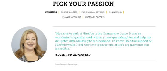
Photos improve your careers page design and help capture your company culture. Nearly 80 percent of millennials look at people and culture fit when considering prospective employers (Inc.). Multimedia is the best way to showcase the people on your team, as Hirevue does, and offer candidates a glimpse of your culture, office and events.
Use lists and headings: no walls of text

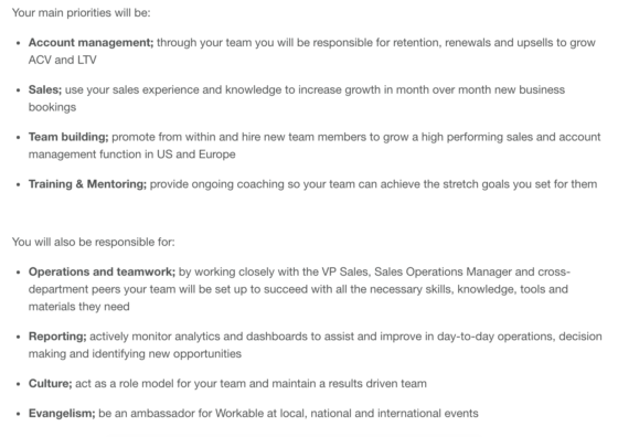
Everyone likes lists. Your careers page doesn’t have to be filled with “Top 10 Reasons to Join This Company” content, though. Organizing your information in a thoughtful, succinct and readable way will give candidates a better career page UX. Here at Workable, we use targeted, bulleted lists to describe each job’s requirements. This distilled structure offers a simpler user experience and a quicker reading process for candidates.
Optimize for mobile

Your careers page design should be easy to read on every device. Reports from Inc. show that:
- 45 percent of job seekers use mobile devices to search for jobs at least once a day.
- 54 percent read company reviews from employees on mobile and
- 52 percent research salary information.
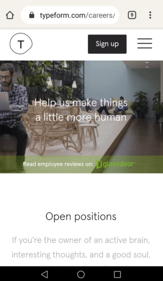
You can optimize your site for candidates who’re using their mobile to search for jobs by adding responsive design or building a mobile version, like Typeform. By making your site easy to use on mobile you’re increasing your potential applicant pool and encouraging the best candidates to apply from any device. You’ll achieve this by means of readable text, user friendly forms, concise language and limited, but attractive visuals.
Creating a user-friendly careers page with Workable:
Workable will build and host your mobile-friendly careers page so you can share it via social media, email or on your website. We create your career pages to give candidates the best user experience. Then, you can easily add photos and video links and arrange images and text to appeal to your ideal candidates.
If you’re listing your jobs with Workable, you can embed them in your existing careers site for a seamless user experience. This allows you to easily categorize your open positions and customize your site’s design.
Read also:
Frequently asked questions
- How do you create a good careers page?
- A great way to improve your careers page design is by being clear and concise. Listing job titles, using photos to engage your audience, and optimizing your career pages for mobile are great ways to make your listings stand out.
- What should a career page look like?
- A career page allows your business to share your story and engage with potential candidates. You can use photos and testimonials to show potential employees job opportunities at your business.
- Why have a careers page on your website?
- Careers pages are an essential tool for any company looking to hire. A well-structured page will have more applicants finding their way onto the site, which reduces time spent sourcing candidates.


