How to monitor recruiting pipeline with Workable reports

In your mind, how do you visualize your recruiting process? A common way is to think of it as a pipeline that begins when candidates apply to your jobs or get sourced. It ends when you hire the best candidate.
With this hiring pipeline view in mind, how can you keep track of hiring stages and all the candidates as they move from one stage to another? Workable gives you the full picture through its two recruiting pipeline reports:
- The current pipeline report. This report provides a snapshot of your hiring process at one specific moment. This way, you can easily present your recruiting progress to other departments or senior management. It helps you answer questions like:
- What is the current hiring status across roles and departments?
- How many candidates are currently in each hiring stage?
Looking for better reporting analytics? Workable’s reports will refine your recruiting process. Request a demo to learn more today.
- The historic pipeline report. This report is a look at the past. It helps you analyze your previous hiring processes, so you can use data to improve your future hiring. This report essentially reflects common recruiting yield ratios – metrics that show what percentage of candidates advance from one hiring stage to another. It helps you answer questions like:
- How many candidates do we need at each stage to hire confidently? If you usually receive 500 applications to make one hire, you might try to hit that number of applications in a future hiring process before you feel comfortable making a hiring decision.
- How efficient are my hiring stages? For example, screening calls help you narrow your applicant pool, so that hiring managers interview only a few qualified candidates. If most of your applicants move forward from screening calls, then your hiring team spends a lot of time interviewing a large number of candidates. Spotting this in your historic pipeline report may prompt you to rethink your phone screen interview questions.
Why should I use Workable to manage recruiting pipelines?
The traditional alternative to an automated system like Workable is spreadsheets. But, monitoring your pipeline with spreadsheets can get complicated since you’d need to:
- Input new data (e.g. candidate names, dates) continuously,
- Sort columns by hiring stage and count how many candidates are in each stage,
- Use formulas to calculate percentages of candidates who moved from one stage to another.
While this approach may grant results at first, it’s difficult to maintain and doesn’t scale well. The more candidates you get, the tougher it will be to track them in spreadsheets.
Workable offers a solution to make tracking your pipeline effortless. You only need to move your candidates along your pipeline and Workable will record every activity and generate detailed recruiting reports.
What do Workable’s recruitment pipeline reports look like?
Workable provides an overview of all your hiring processes per department at any time. You can access reports easily via a pie chart icon on the main menu bar.

Current pipeline report
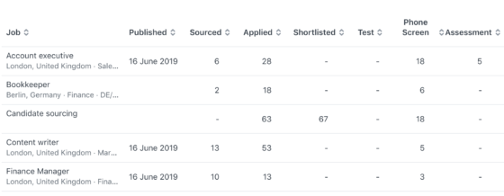
Choose a particular job or department and Workable will immediately show your report. Pipeline data is displayed as a stacked bar chart; the length of each color block within the chart is determined by the number of candidates in that stage.

For more in-depth analysis of the data, study the table below the bar chart. See at a glance:
- The active jobs on your Workable dashboard and if/when they were published.
- The number of candidates within each stage. This can tell you if too many candidates are waiting at a particular hiring stage and need attention.

Historic Pipeline Report
Workable’s Advanced plan comes with an advanced reporting suite that includes the historic pipeline report. This report provides a data-driven view of your screening process to help you plan future hires more effectively.
You can choose a particular job or department, or generate a report for the candidates in all active (or archived) jobs. Since this is a report on past hiring processes, you can select a time frame to display data within a certain period.
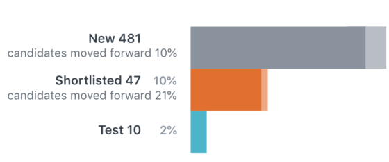
The bar chart at the top of the page shows multiple bars with numbers and percentages.

Each bar represents a hiring stage and shows:
- The number of candidates who reached this stage
- The percentage of candidates who reached this stage
- The percentage of candidates who moved forward from this stage
The darker section of each bar represents the number of candidates who have been left at that stage.
The lighter section indicates the number of candidates who have been disqualified in that stage.
A detailed table outlining all the information is located directly below the bar chart.

You can export the data of this report as a CSV or a presentation-ready PDF. Study your pipeline to discover patterns and find ways to boost your efficiency and hire more effectively.
Related Reading
How to measure talent pipeline metrics


