Why it was love at first sight for our interview scheduling link
As a product designer at Workable, my role is to make hiring easier for our customers. Every new feature we launch solves a recruiting pain point one way or another. Some features make a subtle impact, gently refining existing processes. Others land with a bang, dramatically changing what day-to-day hiring looks like for recruiting teams.

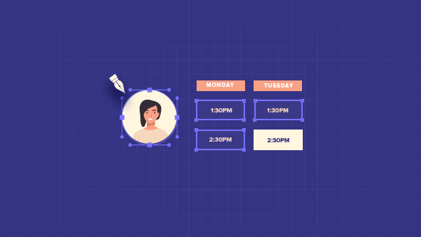
Our interview scheduling link was the dramatic kind. Empowering candidates to view—in real-time—available slots in a recruiter’s calendar, pick one and then book it, customers fell in love with it overnight. In a week it became one of our fastest adopted features. And it’s still one of our most popular enhancements. Usage has grown steadily month by month since launch, doubling over the past few months.
Why?
I was part of the development team lucky enough to work on it, so here’s my take on the two key ingredients behind its success…
Take time to understand the problem
Love for a feature happens when you design something people simply can’t live without. They use it so much, they almost can’t remember what work was like before it arrived. But how do you get to that point?
The first step is by taking time to understand the problem.
In this instance, the pain point seemed specific and straightforward; recruiters spend too much time emailing candidates back and forth trying to lock in a time for an interview. But, before rushing to decode the problem in my brain, I needed to make sure I’d got it exactly right. I needed to empathise with our users. Which meant taking a step back to examine the challenge from different angles.
I started off by looping into the experience of our own in-house recruiters. They’re users of our product and only too familiar with the pain points of scheduling interviews. In the past year, they’ve:
- sifted over 8000 candidates (moving over half of those candidates forward)
- sent 3800+ emails to candidates, and
- arranged 300+ face-to-face interviews and 900 phone screens.
They had lots to share! So, after gathering their insights, we widened our research out to examine the physical environment. To gain a deeper personal understanding of the issues involved, we had to answer three key questions:
#1. Who’s going to use the feature?
From hiring managers to recruiters and admins, we know for sure that we have three to four different user types accessing Workable.
#2. When are they going to use it, and in what context?
Different user types perform different actions. We needed to establish at what point the problem arose for each user.
#3. What’s the optimal experience these people expect to have?
The effort it takes to complete the task determines the solution. Our task was to identify the feedback the platform should provide back to the user.
I want to stick to the last sub-point a bit: “What’s the feedback the platform should provide back?” This is a big checkpoint to tick. In general, we’re talking about scheduling interviews. But, for a recruiter, this is more than a task; it’s the first interaction you have with candidates. This is a biggie. You need to make sure that whatever button you press, you know what will happen next for you and your prospect. That the candidate experience, as well as your user experience, is 100% spot-on.
Don’t overdesign—put the user first
So, we had the problem specified. And we had a clear picture of the challenge. Then came the ideation phase. As a new designer on a team, it can be tempting to “obey your thirst to make an impact”. But, with Workable, product design is all about doing what’s right for the customer. We don’t design features just to design features. We design powerful new features that, governed by logic and function, make the process of hiring easier for our users.
Besides, Workable is an established platform, loved by customers all over the world for its intuitive design. All the component pieces were already there. My remit was to use my skill to design a feature informed by ease of use and a seamless, uncomplicated user experience. And that’s what I did.
What followed, was a big round of internal revisions to refine and perfect the experience. I had all the time I wanted to think about every last detail.
And it shows. Our self-scheduling link is truly loved. It’s loved because it solves one of hiring’s biggest pain points. And it does it without fuss.
Watch this space for news of more features to fall in love with.
This post was written by Andrew Chraniotis, Senior Product Designer at Workable.


