How we approached (video) interviews
The truth is that interviews oftentimes is a stressful and unpleasant experience. It gets more so when you include video.

One of the best commercial digital products I’ve always admired is Google Maps. (Spoiler: it’s not because I am a Google fanboy.) What I like most about that app is the simple fact that whenever I use it, I am always under some kind of pressure; either I am driving in unknown places during vacation or I am abroad exploring and touring different countries. Whenever I use it, I can’t afford any mistakes. I just want reliability and precision.
Since I am fortunate enough to witness how these kind of products are made, how the teams are working on them and even work with some people that built them, I could not help myself – I wanted to find a similar problem to solve: To design an interface for human beings under stress, with a goal to reduce that stress.
Stress mode: on
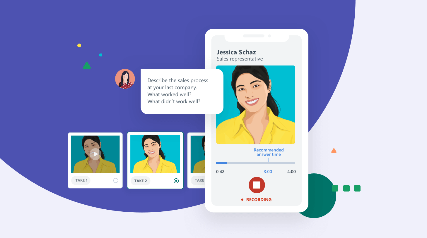
On a bright morning at a recent Workable summit, we were told that a new team would be formed with one goal in mind: build a new product to allow candidates, recruiters, and hiring managers to perform asynchronous video interviews. The business case was solid; on the recruiter’s side, it saves time so they don’t have to schedule phone screens and carry them out with candidates.
On the candidate’s side, it provides a reliable platform to record answers and share them with the company they’re applying to. We wanted to examine a scenario: How would the candidates record their answers? To answer this, we held a design sprint. We talked with several real-life candidates – even those who had performed a video interview in the past.
You can see plenty of feedback about the whole video interview concept in public, such as in this subreddit post. Even the negative stuff is immensely helpful for us, because we want to solve those problems and challenges with our new feature.
The number-one problem we would have to solve, as far as the candidate was concerned, was pretty clear. It’s the stress. I know, it sounds rather generic and vague, but picture this: You are a candidate and you have to record and submit a set of five questions via a browser. It’s a terrifying scenario for many candidates. Questions abound:
- This is my first time doing this. How does this platform even work?
- What if my internet fails me halfway through this process?
- How can I possibly look and act normal when I’m talking into a computer?
Reviewing these concerns can take up a lot of time – and it did.
Design comes into play
Since that list of concerns is quite comprehensive, it was obvious that we had the problem outlined. Here’s our opportunity to jump into Sketch and solve that problem. Right? Wrong.
In fact, it was too early to do that. Instead, we gathered more feedback from candidates who had done video interviews in the past and grouped their responses into specific concerns. That feedback gave birth to a set of principles that would guide us when we built the application.
Here’s the set of principles we outlined – a quick and dirty three-point list:
1. Make feedback always visible
This was the first and toughest one. We needed to allocate valuable real estate on the screen to provide platform feedback to the candidate. This feedback isn’t just about error messages; it’s about guiding the user throughout the whole process. It’s more about providing a north star.
Of course, it plays well with error messages too. Assuming the person will get the concept that a message is always there showing what’s going on at any given time, this will be the spot the candidate will look to for feedback if anything comes up (such as a technical issue).
2. Be picky about the options
The interview process – and especially the video part of it – is a high-stress time for a candidate. So, what you choose to expose to the candidate is extremely important. Remember the Google Maps example at the beginning of this story? Google Maps has been doing an excellent job structuring map and navigation information in such a way that you’ll have your route in the spotlight at any step of your experience.
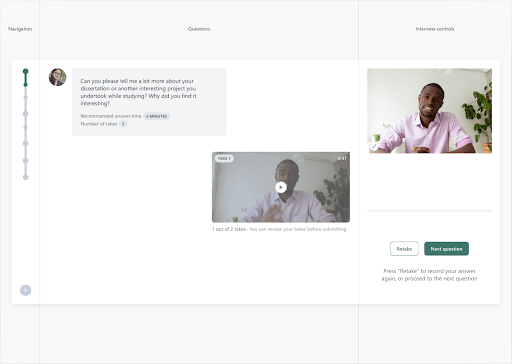
The image below is a great example on how we achieved this for Video Interviews. This is the scenario when the candidate has the maximum number of CTAs displayed in the interface.
3. Separate screen into logical groups (and group relevant actions)
Video interviews in general, is a fairly new concept. That means there’s is no known path to follow and no real precedence to build on. Moreover, it’s not the most widely known or understood interface – yet. Video interviews can be a steep learning curve for many.
So, what I wanted to do was separate the interface into logical groups, and then group those together. By doing this, we would make a more intuitive interface.
In the end, we added three major controls: Navigation, Questions, and Interview. Each one of these three groups represented a specific pool where similar and common actions could be pulled together.

Outcome
Stress is quite intangible – it’s difficult to measure. Business metrics, retention, or adoption is much easier. Because of its intangibility, the stress factor of video interviews was difficult to solve. We can’t outright eliminate it, but we can remove some of the elements that might contribute to it by providing an interface that’s easy to grasp and understand for candidates.
Moreover, we wanted to make the person behind the screen feel that they are in control of the interface. For instance, the recording will start only when they’re ready. The interview begins only when they’re ready. Their answers are sent only when they’re ready to be sent. This puts the whole experience within control of the user, without the need for a “smart” experience that would make decisions and choices for you.
This project has been a great success so far. The numbers prove it too: our data shows that the completion rate of our Video Interviews is much higher than the industry standard. Industry-wide, we found that one-third of candidates actually complete their video interview, whereas candidates using our Video Interview platform completed it two-thirds of the time.
In closing – we set out to craft an interface that was simple to use, to free candidates of the burden of learning the interface and allow them to simply present their best selves during the video interview. Talking into a machine is obviously a bit awkward – we didn’t want candidates to feel that awkwardness. So we set out to make it as comfortable of an experience as possible. While we’re continuing to assess feedback, we’re excited to see how the positive response grows as more and more companies adopt our Video Interviews interface.


