Making Workable mobile
A big team of us here at Workable are lucky enough to spend our time developing and designing new and useful features for our users. It’s what we do and we love it. Over the years we’ve worked on some great projects.

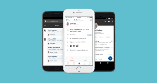
One of our latest challenges was to help our users hire-on-the-go by taking Workable’s ATS and making it fully mobile. I was asked to design apps for three platforms: iOS, Android and mobile web. As challenging as it sounds, working on this product with an awesome team was, and still is, an amazing journey.
In the beginning…
Before we dive into details, let’s go back to 2014 when the Native-vs-Web debate reached its peak. Anyone in the mobile industry had a big decision to make – on which side should they invest time, resources and money?
Our team at Workable wanted to design a mobile experience that would help our customers recruit from anywhere, regardless of the device or platform they were using.
So, we faced a slightly different dilemma: “What comes first and what can wait?”. For us, it was all about prioritizing rather than excluding one technology to the detriment of the other. Since our goal was to support as many devices as possible and the deep linking status was blurry, our best shot was to begin with the mobile web app.
Kicking things off: a complete mobile experience in the browser
I started off by looking at what others had already crafted and what was available in the commercial space. Surprisingly, I ended up with no inspiration at all – remember we’re still in 2014! There were actually very few decent web apps out there. There were some noteworthy patterns, but they were all tailored to the needs of different products.
It became obvious that we had to pave our own path.
Defining the workflow
A solid workflow is the cornerstone of every successful development phase. After a few iterations, our team arrived at the following process:
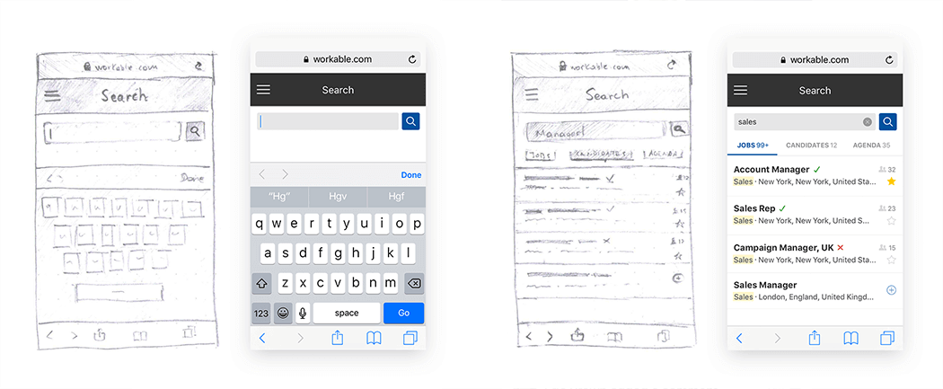
- Wireframing on paper, in Illustrator and Sketch
- Prototyping in InVision
- Creating mockups in Photoshop
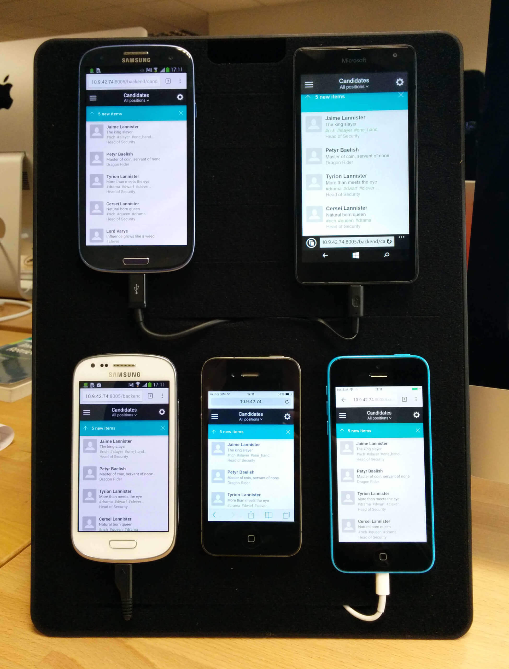
- Reviewing mockups and the user flow in actual devices with Scala View
- Converting the mockups into code (HTML/CSS)
- Testing the results in our device lab with Ghostlab and Chrome DevTools
Creating a consistent visual identity
We needed to apply a familiar visual identity to the user interface. But we also had to build something that would feel intuitive to the different types of mobile users we were likely to have. This was a challenge.
The idea that moved this roadblock aside was to borrow elements from both native platforms (iOS and Android), while keeping the neutrality at some level. To pitch the app-like experience as much as possible, we avoided any web-related design patterns.
Considering Workable? See how we compare to other applicant tracking systems, like Lever and Greenhouse.
Then came Workable for iOS & Android
So, we had a web app. No time to rest. We now needed to complete the full picture with native apps for iOS and Android. This new phase came with an extra challenge: the developers would be converting the design into code themselves. It soon became clear that we needed a more effective collaboration plan and to improve our workflow. We also needed new tools.
It was at this time that we switched from Photoshop to Sketch. We shifted over to Sketch because it’s supported by a vast community. It also integrates with various tools such as:
- Zeplin: for keeping mockups, specs and assets in one place and accessible to anyone within the team.
- Principle for Mac: for prototyping micro-interactions in no time, by importing existing Sketch mockups as starting point.
- Mirror and Crystal: for real-time previewing of designs in actual devices.
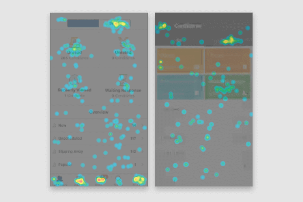
During the post-release stage, we also started collecting valuable insights from analytics that highlighted the way our users interacted with the product.
The era of Material Design
Just before I started designing our Android app, an interesting thing happened in the design and development community. Google introduced Material Design. An innovative visual ecosystem, Material Design proved to be a valuable ally.
Taking advantage of this, we shaped our app in line with this common design language. The result was an intuitive interface that helped our users feel productive when dealing with their everyday hiring tasks.
Working with iOS Human Interface Guidelines
Apple’s guidelines are a bit different, since they focus more on user experience and accessibility. Although some basic UI patterns are suggested, they’re not comparable with the detailed specs of Material Design. On the other hand, there was more room to create customized components that matched our needs.
Cross-platform consistency
While we worked to keep our native apps aligned to their respective guidelines, we wanted to avoid a totally different experience between the two platforms. So we used our brand guides (colors, icons, layouts, font styles) as a UI backbone, adding platform-specific characteristics on top.
A finely-tune, tailored product
Workable’s desktop package offers a great variety of features. Trying to squeeze all of them into a small screen was meaningless. Instead, we focused on what made sense on a mobile device.
We took components from the desktop version and combined them with new, mobile-only traits, such as:
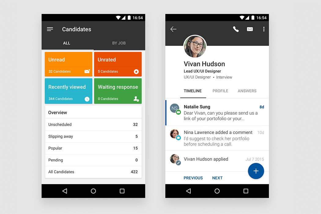
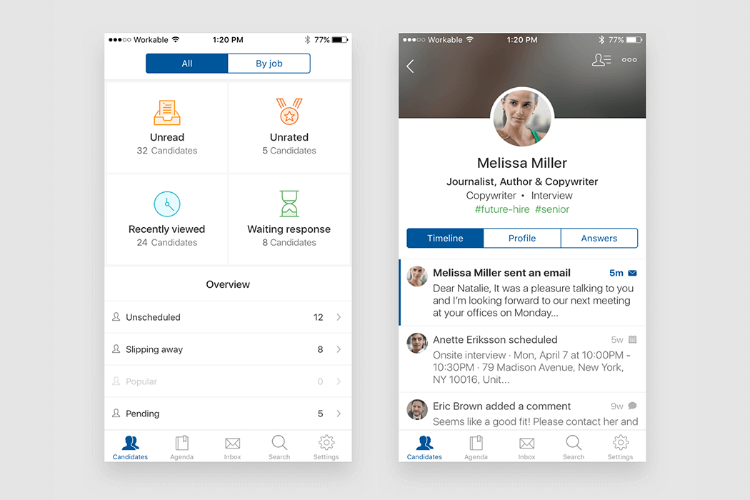
- Smart candidate segmentation: for fast access to the most important tasks.
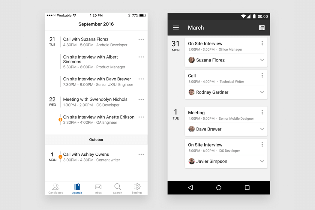
- Hiring agenda: to keep track of, and act on, your day-to-day schedule.
- Powerful search: working across your whole account to find what you need.
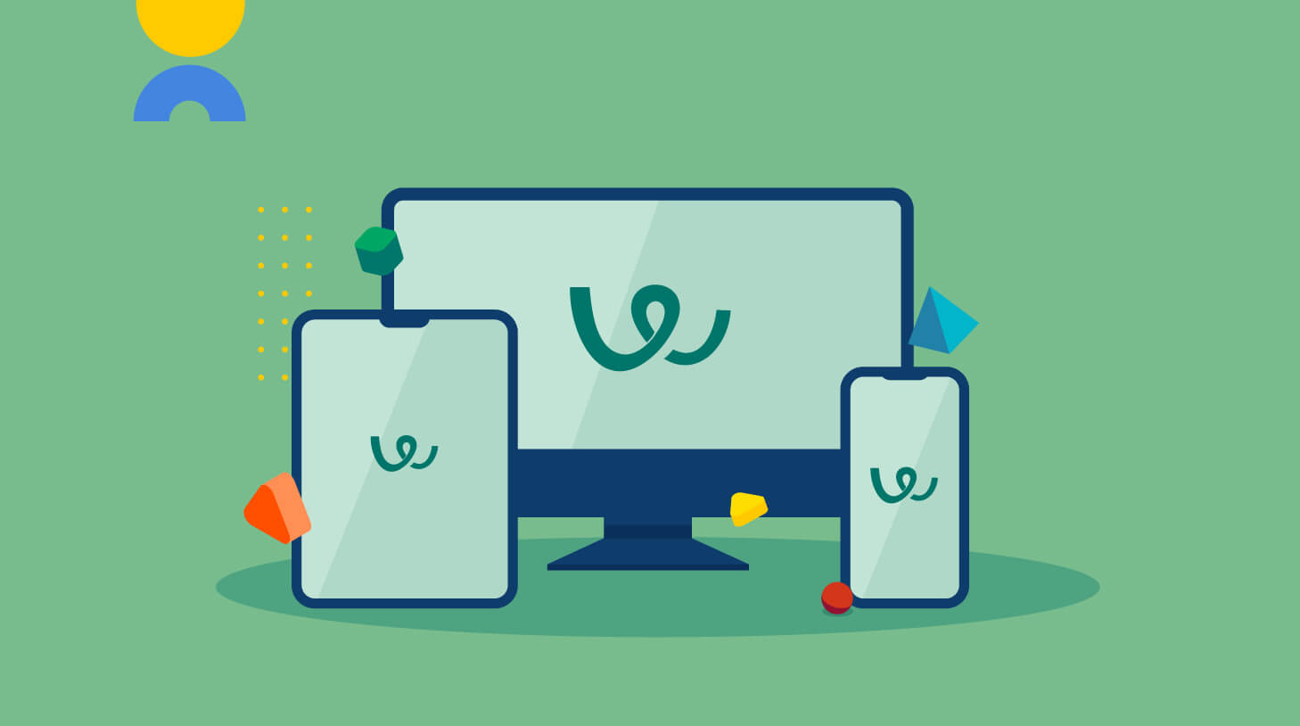
And now, a fully mobile Workable experience
We came a long way in a fairly short time; taking off from a desktop product and arriving at a multi-platform, fully mobile experience. The process was demanding but rewarding. I’m so pleased to have been part of the team. We all worked hard for a common objective: to put Workable in the mobile era.
So if you’re hiring on-the-go, give Workable a try by downloading the iOS app or the Android app. Or, just login to your Workable account from any mobile browser!
Not using Workable yet? The mobile apps are also available as part of the 15 day free trial.