Accessibility features in Workable: A look behind the scenes
During the past few years, Workable’s talented software engineers have been working behind the scenes on making Workable even more accessible.

We’re happy to share that Workable’s accessibility features make the recruitment software even more useable by everyone regardless of ability, context or situation.
About accessibility
In order to better understand what designing for accessibility means, we need to look at it more comprehensively, particularly in talking about universal design. Universal design is the process of making products accessible to the widest possible audience, which includes – but isn’t limited to – people with disabilities. For example, attaching a wheelchair ramp would make a building accessible to people with mobility problems, while a combined ramp and stairs would open access to all.
Accessible design considers the need of people with disabilities. Accessibility in the physical world is the degree to which an environment is used by as many people as possible: for example, pedestrian traffic crossings that play a tone to signal that it is safe for people to cross, braille public signs, tactile paving, and much more.
Accessibility is very often underprioritized in design due to what is seen as a small percentage of users suffering from a permanent disability. That results in people with certain types of disabilities struggling to get equal access to things that many take for granted in society.
About Web accessibility
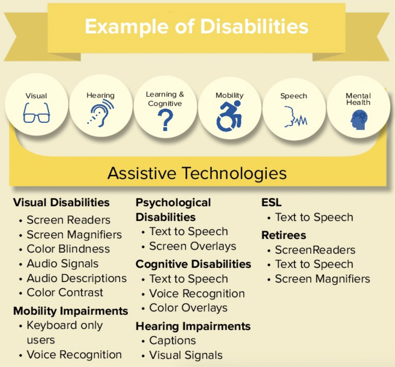
Web accessibility is about making products and services available to all users regardless of their physical ability, internet speed, or the device they are using. It refers to the practice of building web content and applications that can be used by a full range of people, including individuals who have visual, motor, auditory, speech, or cognitive disabilities. Some people have to use assistive technologies to make these tools fully accessible to them.
Accessibility has overlapping principles with usability, but there is a difference: While accessibility focuses on creating more accessible web content for people with disabilities, usability focuses on the general user experience, including users with disabilities.
Web accessibility also benefits people without disabilities, for example:
- people using smartphones, smart watches, smart TVs, and other devices with small screens, different input modes, etc.
- people with “temporary disabilities” such as a broken arm or lost glasses
- people with “situational limitations” such as operating in bright sunlight or in an environment where they cannot listen to audio
Designing first for people in different challenging situations – be it disability, tech limitations, environmental restrictions, etc. – helps us better serve anyone.
Accessibility guidelines
The W3C Web Accessibility Initiative (WAI) develops technical specifications, guidelines, techniques, and supporting resources as universally accepted and standardized descriptors and definitions for accessibility solutions.
Web Content Accessibility Guidelines (WCAG) 2.0 consist of many requirements that guide designers and developers to create accessible content for a wider audience.
WCAG 2.0 guidelines are categorized into three levels of conformance in order to meet the needs of different groups and different situations: A (lowest), AA (mid range), and AAA (highest). Conformance at higher levels indicates conformance at lower levels.
Accessibility features we worked on
We at Workable want to focus on users and their needs in each phase of the design process. Our processes are driven by user-centered evaluation – which means we want to build a fully equitable and inclusive experience for users of our recruitment solution. We do follow the basic accessibility rules when adhering to web standards, but there is more to be done to make Workable entirely accessible above and beyond the usual standard of excellence.
That means Workable aims to enhance accessibility and meet WCAG 2.1 level AA guidelines, by approaching the task at a design and development level. Features we are working on include:
Design level
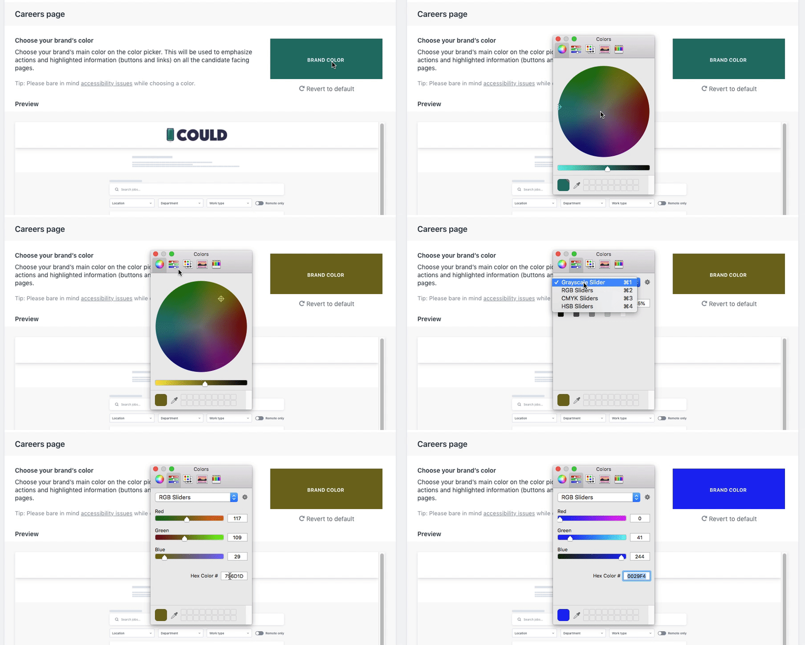
On a design level, for example, we’re thinking about color contrast. Having a low contrast ratio may result in people not being able to distinguish the foreground from the background, or especially read text. Not everyone has a good screen and not everyone has good vision.
We also consider animation accessibility. This applies not only to people who suffer from epilepsy and migraine sensitivities, but to anyone who experiences an adverse reaction to excessive motion on the screen for a longer period of time. Animated interfaces can cause headaches, nausea, dizziness, and other health problems for many.
WCAG 2.0 Level AA speaks to the importance of letting the user resize text: “Except for captions and images of text, text can be resized without assistive technology up to 200 percent without loss of content or functionality.” This guideline states that all website text must be resizable, so we ensure that all text in Workable is adjustable and readable by everyone.
Lastly, icons can convey all sorts of meaningful information, so it’s important that they reach the largest number of people possible. We ensure that the icons we use are appropriately accessible or hidden from assistive technologies where applicable.
Development level
On a development level, well-structured content allows more efficient navigation and processing. We use semantic HTML and WAI-ARIA attributes to improve navigation and orientation on web pages and in applications.
Every image should contain an alternative text which describes the information or function of the image. This text helps screen-reading tools describe images to visually impaired readers, so it has to be descriptive and informative of the action.
Some users are physically unable to use a mouse, and might be navigating through the page using a keyboard alone. Websites need to provide uniform feedback whether it’s for keyboard or mouse users. We have to ensure that all the website’s elements are keyboard accessible and that users can continue to fully interact with Workable even if they cannot use a mouse.
As many users use assistive technologies online, websites must be accessible through alternative user interface devices, such as screen readers and screen magnifiers. Testing Workable with assistive technologies is now a standard part of the process we follow throughout development.
Next steps
Making a website accessible has different levels and depths. Optimizing a website for disabled users is not a one-time effort. As Workable is dynamic and evolves continuously, we need to work on it continuously.
Accessibility to Workable is an ongoing process that we are committed to carrying out at the highest quality possible. For us, it’s not simply about complying with regulations or adhering to standard tech specifications – it’s about providing all our users with a fully equitable and inclusive experience, so that everyone has equal access and opportunity when using our software.

