Designing careers pages that convert
How did we design careers pages that convert more visitors into applicants? Workable's product manager, Konstantinos Vasileiou, explains the process and shares some early metrics.

As a product manager here at Workable, it’s my job to drive improvements to the candidate experience aspect of our product. My team’s most recent project was remastering our Workable-hosted careers pages. This was a priority for a number of reasons. Of all the different marketing channels available for recruitment, careers pages still rate as the biggest magnet for potential candidates. But, over recent years there’s been a shift in candidate mindset. Jobseekers now have a shorter online attention span. They’re also using mobile devices more. Which means, careers pages need to grab their interest fast and make it easy to search and apply—whatever device they’re using. The twist? While candidates want to spend less time applying, recruiters want more information from them.
So, the challenge was on. As well as working for candidates, our new careers pages had to work for recruiters too. To do this our team needed to tackle two things: the application process, and the careers page itself. Here’s what we did it and what impact it’s had so far (hint: early metrics are looking good!).
Careers pages that engage visitors
Recruiters want careers pages that market their brand and attract quality candidates to open roles. Quality candidates are attracted by careers pages that deliver clear information about a company and its available roles. This clear overlap made defining our initial brief relatively easy. Our new careers pages had to focus on two key areas: branding and search functionality.
Powerful ways to showcase your brand
Easy to set up and easy to use across all devices, it’s now also easier to promote your brand through your Workable-hosted careers page. From your company profile page you can:
- add a logo
- provide content about your company—including photos and videos
- select a main brand color for all of your titles, buttons and links, and
- check the contrast ratio of your brand color (this ensures it meets web accessibility standards and is readable and comfortable for the widest possible audience).
These four powerful enhancements take minutes to put in place but, once set, apply automatically across your Workable-hosted careers page.
Faster and more accurate filtering of roles
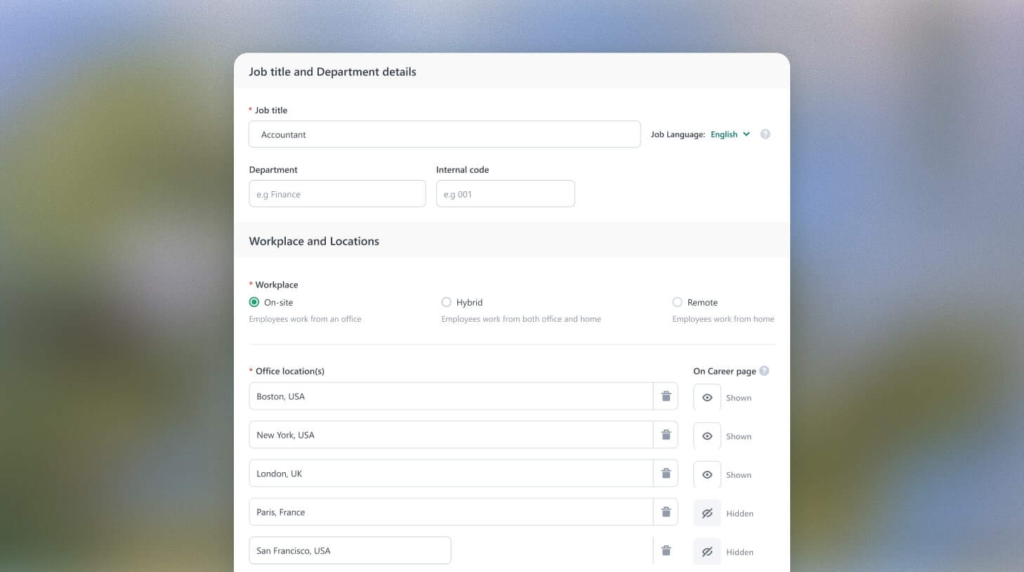
If you’re a prospective candidate, the last thing you want to do when you visit a careers page is wade through tens or hundreds of open roles to find the right ones for you. In fact, chances are you won’t even hang around to look—we know, we’ve been that candidate! Which is why every Workable-hosted careers page now includes sophisticated search filtering. By filtering based on location (or remote roles), department and work type, candidates can quickly find openings that best-match their interests and skills.
Application forms that convert visitors into candidates
Unlike our brief for the careers page, our remit for the application process had a disconnect rather than an overlap. Candidates want application forms that are quick and easy to complete. But, recruiters want application forms that hold rich and detailed information about candidates. So, we needed to make the application process deliver richer profiles with less effort. Here’s how:
- Automate form-filling
Using our new careers page, application forms can be auto-filled using information extracted from an uploaded resume. Within seconds, work experience, education history and all personal details (name, email, phone) get filled in. - Simplify cross-referencing
User research told us that candidates regularly check the job description when filling in an application. So we added a new job description tab to make it easier for them to view it in context, alongside the application. - Include built-in checks
Another usability issue almost all web users (and certainly applicants) face is getting validation errors after submitting an application. Which is why our new application form includes inline validation or “correct-as-you-go” checks. These checks prompt candidates to complete or correct a field of information before they move on. The result? Faster applications, increased completion rates and better user satisfaction. - Optimize for mobile and desktop
More jobseekers are using mobile tech to search and apply for new roles. To address this, we’ve made it easy for recruiters to preview how the application form will appear on mobile as well as on desktop. This means recruiters can make conscious decisions about design and length and ensure it works powerfully on both platforms
Early metrics and later developments
I’m pleased to say we’ve met our challenges. And more! We released our new careers pages and application form two months ago and, the good news is, early metrics are strong. Candidates can now submit rich applications in less than a minute. And the conversion of applicants has increased by 15 to 20%. But we’re not stopping there. We’ve got more advanced enhancements, including language kits, in the pipeline. So, watch this space. And, in the meantime, if you’re not using a Workable-hosted careers page, but would like to find out more, why not get in touch?


